One Dangling grid-area Grew Two Extra Grid Tracks
A grid-area naming an area that doesn't exist isn't ignored: it grows implicit tracks that bend your layout. Measured in three engines, with the spec rules.
Open the page at phone width and the content column has been squeezed into a thin strip, with text wrapping every few characters. The desktop view looks more or less fine. The responsive media query plainly says “single column on small screens”, and that CSS is in effect.
This is a bug this site really hit before launch in August. The project’s own debugging note (ARCHITECTURE.md, section 10.3) records it like this: the whole mobile layout crushed into one column, Chinese text wrapping character by character, page height ballooning to around 5000px, and the cause only found by measuring computed style with Playwright. The culprit was one harmless-looking declaration:
.tag-sidebar {
  grid-area: sidebar;
}
The parent .layout-grid never defined grid-template-areas. In other words, the sidebar area didn’t exist.
Intuitively, referencing a named area that isn’t there should behave like a misspelled property: the browser doesn’t understand it and moves on. CSS Grid does the opposite. It tries to satisfy you, and the way it does so is by growing extra tracks out of nothing.
To write this piece I rebuilt a minimal reproduction and ran it on three browser engines. The numbers and screenshots below are from this run.
One line apart — how different are the resolved values?
The setup is simple. A two-column grid whose parent declares grid-template-columns: minmax(0, 1fr) 200px, switching to a single 1fr column under @media (max-width: 1023px). The only variable is whether the sidebar carries that grid-area: sidebar line.
Here’s phone width (390px) with the line added:
 Figure: this article’s minimal reproduction in a 390px viewport (Chromium, my own screenshot)
The content column is a sliver on the left and the sidebar has been thrown to the bottom right. Notice that it changed rows as well; I’ll come back to that.
Looking at the screen only tells you it’s broken. To learn where, read getComputedStyle(layout).gridTemplateColumns, which returns the tracks the browser actually resolved and ignores the string you wrote in your CSS.
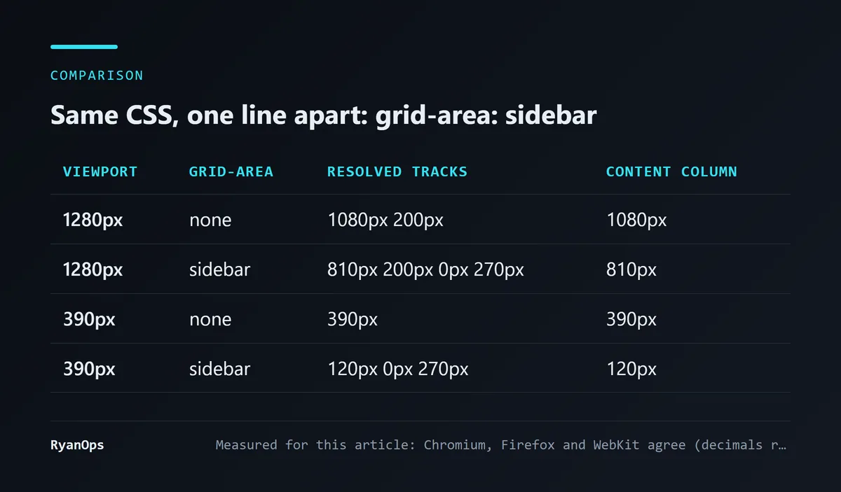 Figure: resolved tracks with and without grid-area: sidebar (measured for this article; Chromium, Firefox and WebKit agree)
Two things are worth stopping on.
Desktop goes from 2 tracks to 4. You wrote two and the browser gave you four; the extras are one 0px and one 270px. That 270px is the width the sidebar’s own content pushed it to. The 200px track your CSS asked for is still there, it’s just empty.
Phone width is more counterintuitive. The CSS says grid-template-columns: 1fr in black and white, and the result is three tracks: 120px 0px 270px. Open the Styles panel in DevTools and that 1fr line is happily applied, not struck through, not overridden. Your declaration wasn’t replaced. The browser added things beside it.
So by eye you only get “the layout looks off”, and you go checking fonts, wrapping, flex min-width. The column count looks wrong, yet the column count you wrote is right.
Is this a browser bug?
I thought it might be. The project’s original note only mentioned Chromium, so this time I installed Firefox and WebKit too and ran the same reproduction on each.
All three engines resolve the same track structure: four on desktop, three at phone width, with values differing only by rounding at the third decimal place (Chromium gives 810.281px, Firefox 810.283px, WebKit 810.28125px).
When three independent implementations are “wrong” in exactly the same way, they usually aren’t wrong; the spec is asking for it.
Here’s the desktop view, where you can see the sidebar is neither in the column it belongs to nor in the first row:
 Figure: the same reproduction in a 1280px viewport (Chromium, my own screenshot)
What does the spec actually require?
It’s three rules in the CSS Grid spec chained together. Each is reasonable on its own.
Layer one: one shorthand expands into four declarations
MDN’s grid-area page lists the four properties it’s shorthand for:
 Figure: MDN’s list of the four properties behind grid-area (source: developer.mozilla.org)
When you give it a single name, all four receive the same value:
grid-area: sidebar;
/* equivalent to */
grid-row-start: sidebar;
grid-column-start: sidebar;
grid-row-end: sidebar;
grid-column-end: sidebar;
The trouble is seeded right here. One shorthand becomes two placement declarations horizontally and two vertically. The sidebar jumping rows in the screenshots above comes from this: columns aren’t the only thing affected.
Layer two: when the named line isn’t found
Each property first looks for a named line called sidebar-start or sidebar-end. grid-template-areas generates that pair automatically for every named area. We never defined grid-template-areas, so there’s nothing to find.
I went to the W3C CSS Grid Level 1 spec. In the Line-based Placement section, this is what it does when the lookup fails:
Otherwise, treat this as if the integer ‘1’ had been specified along with the
<custom-ident>.
So it degrades to grid-column-start: sidebar 1, meaning “the first line named sidebar”.
Layer three: when no line has that name either
This is the decisive step. The spec doesn’t tell the browser to give up. It says this:
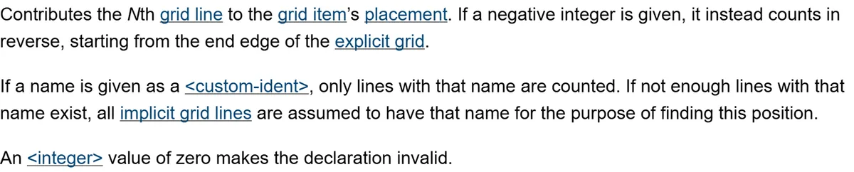 Figure: how CSS Grid Level 1 handles a name with too few lines (source: w3.org)
“All implicit grid lines are assumed to have that name.” To give sidebar 1 something to resolve to, the browser grows implicit tracks beyond the explicit grid and treats the lines out there as the one you asked for.
Chain the three together and a name pointing at thin air gets faithfully translated into “please open a few more tracks outside the grid I defined”.
So why are the extra tracks 0px and 270px?
This part is my reading of the measurements; the spec doesn’t spell it out in these words.
Implicit track size comes from grid-auto-columns, whose initial value the spec defines as auto. An auto track sizes to its content, so the one holding the sidebar gets pushed to 270px by that content, and the empty one sitting between it and the explicit grid has nothing in it, hence 0px.
Work backwards from there. The original 1fr means “take whatever space is left”. Now a 270px track claims its share first, leaving 120px of a 390px viewport for the content column. That’s how the content column got flattened.
It also explains why the damage differs from site to site. The wider the sidebar’s content, the narrower the content column ends up. The project note describes a column crushed to near character-by-character wrapping; my reproduction’s sidebar content is shorter, so it kept 120px.
Why was there never a single warning?
I think this matters more than the bug itself.
CSS has no error category for “referenced something that doesn’t exist”. A misspelled property name, grid-are: sidebar for instance, gets dropped at parse time. But grid-area: sidebar is entirely valid syntax: <custom-ident> is a legal value type and sidebar is a legal identifier, so the parser has no reason to reject it. What the name points to isn’t resolved until the layout algorithm runs, and that algorithm’s spec explicitly says to fall back on implicit lines when there aren’t enough, so that step doesn’t count as a failure either.
Which means:
- The DevTools Styles panel doesn’t flag it, because the declaration is valid.
- The build doesn’t fail; to a bundler it’s just legal CSS text.
- The console is clean.
- As for linters, catching this requires knowing whether another selector (possibly in another file) defines a matching
grid-template-areas. That’s cross-selector layout reasoning. I haven’t gone through stylelint’s rule list one by one, so I won’t claim no plugin can do it, but it’s outside what linting normally covers.
The whole toolchain says nothing’s wrong, and only the computed layout knows otherwise. A failure that quietly does something else is far harder to catch than one that throws, because you don’t even get a hint about where to look.
How did this line get in there?
Here I can only speak to what’s on record.
In the project’s git history, the commit that fixed this bug (2026-08-12, the one that added bilingual support and the sticky tag sidebar) says in its message that mobile QA turned up a “leftover” grid-area: sidebar with no matching grid-template-areas. The ARCHITECTURE.md note says the parent “never defined” named areas.
The broken version of the CSS was never committed on its own, so I can’t reconstruct from history exactly when or why it was written. An earlier version of this article described its origin more confidently than the record supports, and I’ve removed that passage.
The one lesson that is certain, and it’s the one the project note records too: grid-template-areas and the children’s grid-area belong together. Use the whole set or leave none of it behind. The moment you write grid-area: some-name, go back and confirm the parent really has that area. When you delete the parent’s named areas, clear every grid-area that references them in the same commit. It’s the same relationship as a function and its call sites, except CSS won’t tell you one side went missing the way a compiler would.
Next time a layout goes sideways, how should you investigate?
This is the order I’d follow.
Stop staring at the screenshot. A screenshot only tells you the result is wrong. Fonts, wrapping, width calculation and track count all look alike in one.
Measure computed style. One line does it:
getComputedStyle(document.querySelector('.layout-grid')).gridTemplateColumns;It returns the resolved track sizes, for example "120.281px 0px 269.719px". Compare that with the 1fr you wrote; when the track count doesn’t match, you know the problem is in grid placement and you can stop guessing at fonts or content width.
In this reproduction, that step was the dividing line. Before I measured that 0px track, every hypothesis looked plausible. Afterwards the only thing left to find was who opened the extra tracks.
Turn it into a regression test. This kind of bug is easy to reintroduce the next time someone touches the layout, and it happens to suit an assertion well, because track count is a clean number:
const tracks = await page.evaluate(
  () => getComputedStyle(document.querySelector('.layout-grid')).gridTemplateColumns.split(' ').length,
);
// narrow viewports should be single column
expect(tracks).toBe(1);
I prefer this style of test myself. Screenshot comparison produces false alarms from fonts, anti-aliasing and content updates; counting tracks is much steadier, and when it fails the message points at the cause. Its blind spot is that it only catches the “track count changed” kind of breakage, so other layout problems still need other tests.
What this reproduction doesn’t cover
To be clear about the edges of these measurements, so you don’t apply them where they don’t hold:
- I only tested a single-name
grid-area. Four-value forms, or mixes of numbers and names, expand under different rules, and I didn’t measure them. - The reproduction is the simplest possible two-column grid. With nested grids,
subgrid, or a parent that setsgrid-auto-flow, the track count may differ. - All three engines ran through the builds bundled with Playwright, emulating a 390px viewport on a desktop system, not on a physical phone.
- I did not reproduce the exact symptoms in the project’s original note (a column crushed to character-by-character wrapping, page height around 5000px), because the sidebar content differs. The mechanism is the same; the severity depends on your content.
The one thing to take away
CSS has no undefined. Reference a named area that doesn’t exist and what you get is neither an error nor being ignored, but a separate behavior the spec defines: implicit tracks. Every tool will tell you this CSS is fine, because by the spec it is.
If this read-the-spec-to-the-end approach interests you, the MySQL partitioning piece works the same way, with a database manual in place of a CSS spec.


